Hello Everyone!!
This is Nikita here with my very first post for BGC.. This is new for me, so I am kind of nervous but also a bit excited to see how this turns out. I blabber a lot, but today, I'll get straight to the point. :P
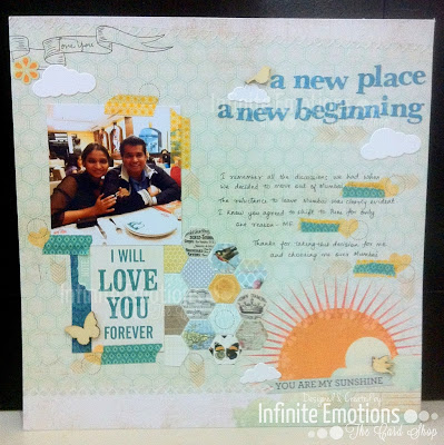
Today I am going to share with you a Scrapbook Page that I made last week for an old colleague's 5th Wedding Anniversary. I am sharing one of the 15 Pages that I made. I wanted to do this as a series on my blog with one post for every page and so far, I've only shared the cover page on my blog. So you guys get to see the first page even before it goes live on my blog. I will post it on my blog as well, in a few days, but you guys saw it first, alright? Yay!! :)
Warning: Picture Heavy :)
Warning: Picture Heavy :)
This page was made to record the couple's move to Pune from Mumbai. If you know me and my posting style, you would know that I don't show the project just like that. I generally give sneak peeks of the project from different angles because I like to build the suspense :P and then when I have just about exhausted every possible angle, I show the final picture. I hope you have the patience... :P
Anyway, when I was planning the LO, I first decided what I was going to use as the Base Sheet. I selected one of the Pre-Printed Sheets from the My Sunshine 12x12 Paper Stack by Die Cuts With A View and that made the layout way easier than a blank page would have.
But before I sign off, here's a list of the products I used to make this layout..
Anyway, when I was planning the LO, I first decided what I was going to use as the Base Sheet. I selected one of the Pre-Printed Sheets from the My Sunshine 12x12 Paper Stack by Die Cuts With A View and that made the layout way easier than a blank page would have.
I started with adhering the picture to the top left of the page, a little lower than the ribbon. Then I cut out a journaling card from the For The Record 2, 12x12 Kit by Echo Park and adhered it under the Photo.
I really wanted to use hexagons on the LO because the page already had some, and I found this amazing 6x6 sheet in the My Mind's Eye Be Amazing Follow Your Heart Paper Pad that was perfect. So I cut a number of hexagons out and pasted them.
{Image Source: My Mind's Eye}
I added washi tape and a Wood Venner Studio Calico Butterfly to add some dimension.
On the ribbon, I stamped 'Love You' using a Dear Lizzy Stamp. As the layout said 'You are my Sunshine' I added some clouds, cut out using Memory Box Puffy Clouds Die.
I added the Page Title on the top right of the page using the Lower Case Alphabet Dies from Memory Box, cut out from a colour co-ordinated piece of Scrap PP. I realised after I had adhered the alphabets, that it was a bit crooked, because I used the hexagons on the page as a guide to align my letters and what do you know, they were printed crooked. But it didn't look bad, so I let the be..
I added more clouds here and a Wood Veneer Bird. :)
I did the same on the bottom right of the page as well. :) There was a tag like image printed on the extreme bottom right with blank lines and it felt weird to leave them blank. So I stamped the phrase 'True Love' from the Love2hug Stamp set by The Stamps of Life in Memento Cantaloupe Ink.
I did the journaling by hand and just between you and me, I messed up. When I was making this layout, I should have been halfway through my REM sleep, but I was up, 2 large mugs of coffee down, and that meant awake, but zombie-awake. So I spelt 'reluctance' a little wrong.
The page was so perfect and the base sheet was obviously one where I could do the journaling on, directly without adding any more layers. So , after the word 'Mumbai' I added someWashi Tape to cover up my blunder. TapeS, actually. And then I stamped some geometric shapes around them: Heart - Love2hug Set from Stamps of Life in Cantaloupe, Circle and Arrows from the Sunnier Days Simon Says Stamp Set in Rich Cocoa and Desert Sand, respectively. And I must say, it worked. Just to maintain the design, I stamped these three shapes on other parts of the page as well.. :)
And now that I have given you enough sneak peeks, I think it's time for me to show you the entire page. So here it is...
I know that dragged on, but I couldn't resist. I hope there was some piece of useful information for you in that (very) long story ;)
I'll be back again tomorrow with a brand new challenge. So keep an eye out for that!! :)
Others (Linked to Simon Says Stamp or their respective stores)
See you soon!! Happy Crafting...
Love,
Nikita..


Hey nikee-taa...I just love ur work...amazing concepts.like d way u put up beautiful lil things together.n yes ur brilliant rectifying skills.keep up.
ReplyDeleteThank you Jia, for taking the time out and visiting here... Means a lot!! Thank you for your sweet comment as well.. :)
DeleteThis is super duper layout nikita..... its awesome u showed all the details so clearly....
ReplyDeleteThank you Varshitha... Glad you liked it.. :)
Deleteloved every bit of the layout! lovely creation nikita
ReplyDeleteThank you so much, Sharada.. :)
Delete